Absolute Measurement
CSS supports a variety of real-world measurements. Each absolute length unit supported by CSS is defined in the following table.
Open table as spreadsheet
| Unit Abbreviation | Description |
|---|---|
| in | Inches |
| cm | Centimeters |
| mm | Millimeters |
| pt | Points, 1 point is equal to 1/72nd of an inch |
| pc | Picas, 1 pica is equal to 12 points |
Absolute lengths are not intended for the computer screen; they are intended for where a physical measurement is necessary. For example, printing a document requires real-word measurements. When you are composing a web document, you want the printable version of that document to be made using lengths that are reliable for the print environment.
On the other hand, when absolute measurements are applied to the computer screen, some inconsistencies surface.
The Pitfalls of Onscreen Absolute Measurement
Coding real-world physical lengths into a computer isn’t as easy as it may seem. When applied to a computer screen, physical measurements are based on pixels. Pixels are tiny dots that a computer monitor uses to create the image you see, and the number of pixels displayed depends on the monitor’s screen resolution. For example, a computer monitor set to an 800 × 600 screen resolution displays 800 pixels horizontally and 600 pixels vertically for a possibility of 480,000 total pixels.
Windows defines one inch as 96 pixels, by default. The definition of an inch as 96 pixels depends on an operating system display setting called DPI, or dots per inch. The DPI setting of an operating system is a user-configurable setting for defining the number of dots (or pixels) that make up an inch.
In the earlier days of the web, Macintosh and Windows had different DPI settings; a Mac’s default DPI was 72 and Windows’ was 96. Today all modern browsers, including those on the Macintosh, have standardized on Windows’ 96 DPI measurement as the de facto default standard for DPI. While this de facto standardization makes for a greater likelihood of consistency, because the DPI setting can be customized, absolute measurement cannot be relied upon for onscreen layout. For example, Firefox still includes a setting in its font options menu for the DPI to either 72 or 96 DPI, and it’s possible to change the DPI setting through other means, such as within Windows display settings control panel.
Figure 2-16 shows Firefox 1.5’s DPI setting, a setting that has since been eliminated from Firefox 2.0, since Macs just use the same DPI setting as Windows these days.

In the next two examples, you set up an experiment to see how the DPI can affect absolute measurements in CSS, and ultimately discover the reason why absolute measurements are not suited for onscreen layout purposes.
Try It Out-Testing 96 DPI Equals an Inch
Example 2-5. To see a side-by-side comparison of pixels to inches, follow these steps.
- Enter the following document:


- Save the document you just created as Example_2-5.html.
- Open the document in your browser of choice. Figure 2-17 shows twoelements: The topelement has a height and width of 1 inch, and the bottom

How It Works
By default, browsers conform to the Windows default of 96 dots per inch for the onscreen definition of what an inch is.
Obviously, since absolute measurement is not well suited for onscreen layout, there must surely be another, right? Yes! The other method of measurement in CSS is relative measurement.
Relative Measurement
Relative measurement is better suited for the purpose of onscreen layout. The following table defines the four types of relative measurement that CSS allows.
Open table as spreadsheet
| Unit Abbreviation | Description |
|---|---|
| em | Length relevant to the nearest font size. |
| ex | The x-height of the relevant font (height of the letter x). |
| px | Pixels, relative to the viewing device, for example, a computer monitor. |
| % | Percentage measurement; how percentage length is calculated depends on what property it is being applied to. |
The em and ex units are measured relative to the font size of a document, pixels use the real pixels of the monitor’s screen resolution, and percentage measurement depends on what property it is being applied to. In the coming sections you explore each type of relative measurement in greater detail.
Measurement Based on the Font Size
Measurement in em is currently the most favored of relative measurement for onscreen layout, for most measurements. A measurement that is relative to the font size allows for designs that scale up and down gracefully with the user’s font size preferences.
Try It Out-Comparing em to Pixels
Example 2-6. To see how the em measurement compares to pixel measurement, follow these steps.
- Enter the following XHTML document:


- Save the preceding document as Example_2-6.html, and load it up in your favorite browser. When Example 2-6 is loaded up, you should see something like that in Figure 2-18.


How It Works
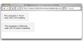
In Figure 2-18 you see that 12em is the same measurement as 192 pixels. When the font size is set to 16 pixels (the default in all modern browsers). So with the em unit, you can layout a whole web page that scales with the user’s font size preference.
All modern browsers provide a mechanism for scaling the font size up or down to the user’s preference. On the Mac, -+ increases the size of the text, and on Windows, it’s Ctrl-+. Figure 2-19 shows what happens when the text is scaled up in Safari or Firefox with Example 2-6 loaded.

In Figure 2-19, you see that the 12em measurement no longer matches the 192-pixel measurement when the text is scaled up. IE 7 and Opera do not display the effect the same as seen in Figure 2-19, however, since they scale everything, even the size of a pixel.
Figure 2-20 shows what happens when text is scaled down.

In Figure 2-20, the opposite of what you observed in Figure 2-19 has happened; the top paragraph is now smaller than the paragraph with a 192-pixel width. Em measurement lets you layout a web page with the font size preferences of the end user in mind, which in turn makes your website more accessible to people with visual disabilities. Again, IE 7 and Opera do not display the effect the same as shown in Figure 2-20, since they scale all content, which many would argue is much better than having designers trying to design scalable websites with features like the em unit. The IE 7 and Opera approach takes designers out of the equation and puts users in charge, which is much better for accessibility.
Like the em unit, the ex unit is based on font size, but unlike the em unit, the ex unit is based on the height of the lowercase letter “x.”
Measurements Based on the Height of the Lowercase Letter x
The ex measurement, also known as x-height, is (like the em) based on the font size. However, the ex measurement is relative to the height of the lowercase letter x. The ex measurement is another unit of measurement derived from typography.
Like measurement in inches, the ex measurement is unreliable, but for different reasons. Because it is difficult to determine the actual height of the lowercase letter x for a given font, most browser creators take a shortcut in implementing the ex measurement. Instead of relying on the height of the lowercase letter x, ex measurement is defined by taking the measurement of half of 1em, or 0.5em. Because of its inconsistencies, ex measurement is yet another unit of measure to be avoided when designing for display on a computer monitor.
Pixel Measurements
As you may have guessed from the discussion in this chapter about absolute measurements, pixels, the px measurement, are measured relative to the computer monitor’s settings. This measurement depends on the resolution of the user’s monitor. For instance, a 1px measurement viewed at a resolution of 800 × 600 is larger than a 1px measurement viewed at a resolution of 1024 × 768.
Pixels are easiest to understand when they specify the width and height of an image because most images are created based on the number of pixels they contain. This type of image is known as a bitmap image. Examples of bitmap images are the J-PEG, GIF, and PNG image formats. These image formats store information about an image by the pixel, and those are mapped together to create the image that you see. To illustrate my point, Figure 2-21 is a screenshot of Safari’s window controls from the upper left-hand corner of Figure 2-20 while zoomed to the maximum of 1600% in Photoshop. At this level of detail the pixels are clearly visible as individual squares, and it becomes easier to imagine what a pixel is, since you’re actually seeing them.

Keeping the image portrayed in Figure 2-21 in mind, when you measure in pixels with CSS, the individual pixels are as wide as the squares you see in Figure 2-21, which can be larger or smaller depending on the screen resolution setting of your monitor.
Pixel measurements have some advantages and disadvantages. Pixel measurements use the actual pixels on your computer monitor. Although that is often fine for screen display, it is not as precise when it comes to printing documents. The size of a pixel can change depending on many factors, among which are monitor size and resolution and the fine-tuning settings that stretch and shrink the display output. Therefore, defining a pixel measurement for print leaves lots of room for browser inconsistencies. How big is a pixel in the real world? It simply isn’t a constant measurement for physical length the same way that centimeters are.
| Important | Use the right tool for the job! Pixels should be used for measurements where a user’s font size preference won’t be a factor, and where a real-world, absolute length wouldn’t be superior, such as for print. An example of a good place to use pixels would be for the width of a border around a box. |
The last type of relative measurement that CSS has to offer is percentage measurement.
Percentage Measurements
Percentage measurements are always dependent on something else; therefore, percentage measurements are also a form of relative measurement. The behavior of a percentage measurement changes depending on the element to which the measurement is being applied. Try applying a percentage width yourself.
Try It Out-Experimenting with Percentage Measurement
Example 2-7. To see how percentage measurement works, follow these steps.
- Enter the following markup into your text editor.


- Save the document as Example_2-7.html, and load it up into your favorite browser. When you load Example 2-7 into a browser, you should see something like Figure 2-22.


How It Works
Percentage measurement works differently depending on what property it is applied to; you’ll continue to see examples of this throughout this book. In Example 2-7, you applied the declaration width: 100%; to the
element, and when loaded into a browser you see that the
element expands for the whole width of the window. If you’ve been paying attention, you might have noted that this result is identical to the one you observed for Example 2-3, earlier in this chapter. Yes, when applied this way, the width: auto; declaration and the width: 100%; declaration produce identical results; however, there are fundamental differences between these two completely different methods of specifying width. The percentage method used here calculates the width of the
element based on its parent element. In this case, the parent element is the element, and the width of the
is set to 100% of the width of the element, no ifs, ands, or buts. Although you may not see why auto width is different at this point, it is, and that is a topic that is much too big to get into right now.
Because it’s a presentational language, most of CSS is affected in some way by length and units of measurement. The fundamental unit for all measurements when you design for display on a computer monitor is the pixel, because computers display images in pixels. You can define lengths relative to font sizes, using em units as the most practical and consistent solution. Absolute lengths, on the other hand, are better suited for print because of the multitude of inconsistencies that occur when absolutes are used for presentations on a computer monitor. In the next section, I continue the discussion of CSS property values with a look at how CSS interprets numbers.
Numbers
CSS allows numbers as values for several properties. Two types of numbers are accepted by CSS: integers and real numbers. Like strings, integers and real numbers are data types and are often used in CSS for the measurement of length. The first type, integer, is expected to be exclusively a whole number, meaning no decimals are allowed.
Integers
In CSS, an integer may be preceded by a plus (+) or minus (-) to indicate the sign. Although some properties do not accept negative values, many do. As you can see in the following example, one property that allows negative values is the margin property.
Try It Out-Setting a Negative Margin
Example 2-8. To see what happens when the margin property has a negative value, follow these steps.
- Enter the following markup:

- Save the markup that you entered as Example_2-8.html, and load it into your favorite browser. You should see something like what you see in Figure 2-23.


How It Works
From Figure 2-23, you can see that the position of the
element has been altered by the addition of the negative margin. It has been moved a little off-screen on the left and just a tad off-screen on the top. This is one example of how you can use an integer in CSS.
Real Numbers
Real numbers can have a decimal value, and decimal values increase the precision of measurements in CSS. As was the case for integers, real numbers in CSS can also be preceded by plus (+) or minus (−) to indicate the number’s sign. The value 1.2em, for example, means 1.2 times the font size. As in mathematics, a positive sign is assumed if no sign is present. If I have a declaration that says margin-left: -1.2em;, this causes an element to shift to the left 1.2 times the font size.
CSS provides some basic and reasonable rules for the specification of integers and real numbers in property values.
No comments:
Post a Comment